

Mockup HÄR
Dyslexi och avkodning
.
Course in book binding
Book design, book binding
2022
Book design, book binding
2022
.
Brief:
How does the typical book look like on the shelves of "pedagogy"? By doing a detailed research and analysis at Sundsvall's stadsbibliotek on these shelves, a book is going to be designed binded into the style-typical features where form, typography, format, weight, etc. is taken into account. So back to the question - how does the typical book look like on the shelf of "pedagogy"?
How does the typical book look like on the shelves of "pedagogy"? By doing a detailed research and analysis at Sundsvall's stadsbibliotek on these shelves, a book is going to be designed binded into the style-typical features where form, typography, format, weight, etc. is taken into account. So back to the question - how does the typical book look like on the shelf of "pedagogy"?
Team:
Lina Svärd
Lina Svärd
Softwares used:
Adobe Illustrator
Adobe InDesign
Adobe Illustrator
Adobe InDesign
.
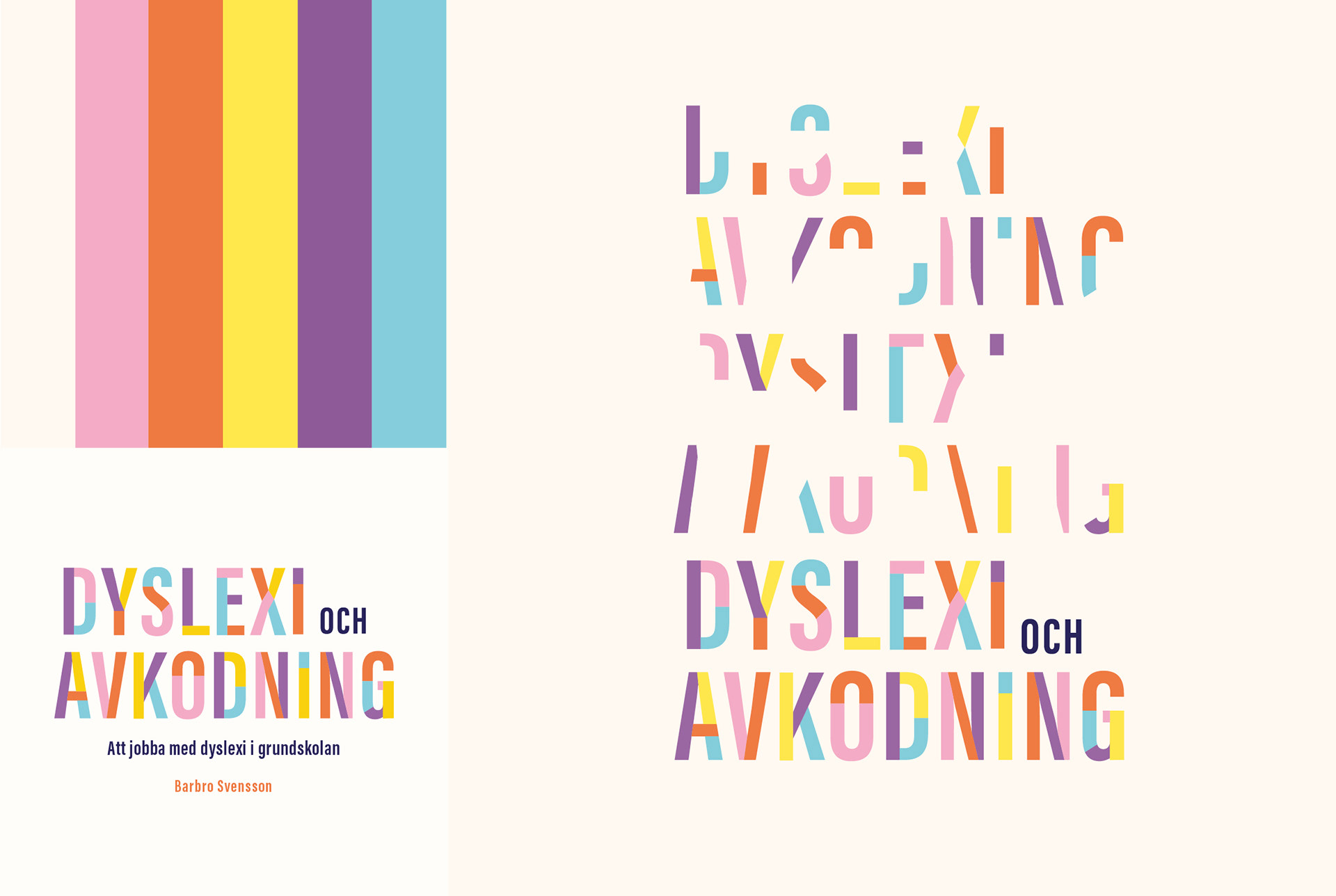
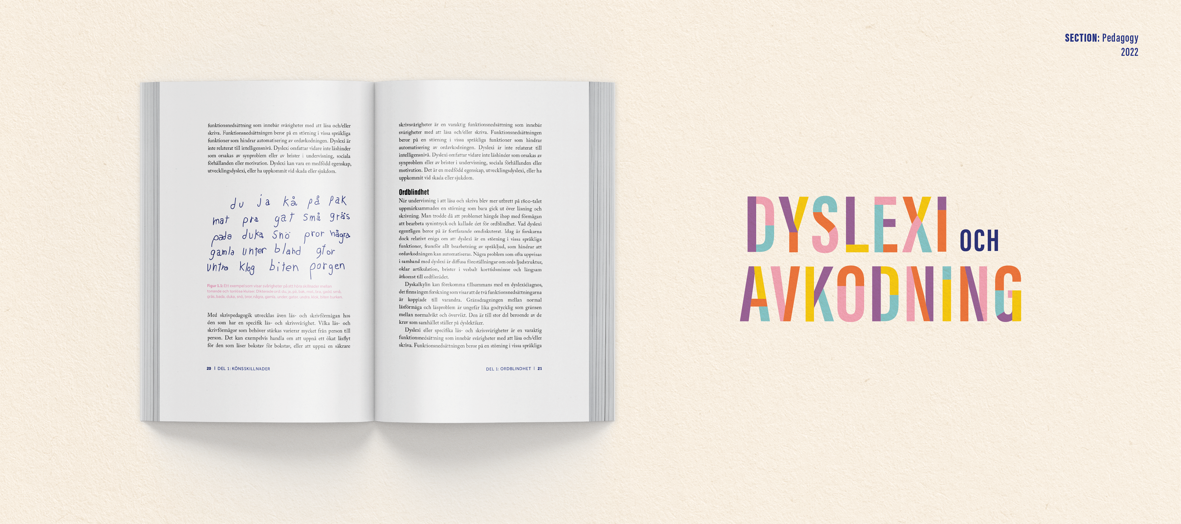
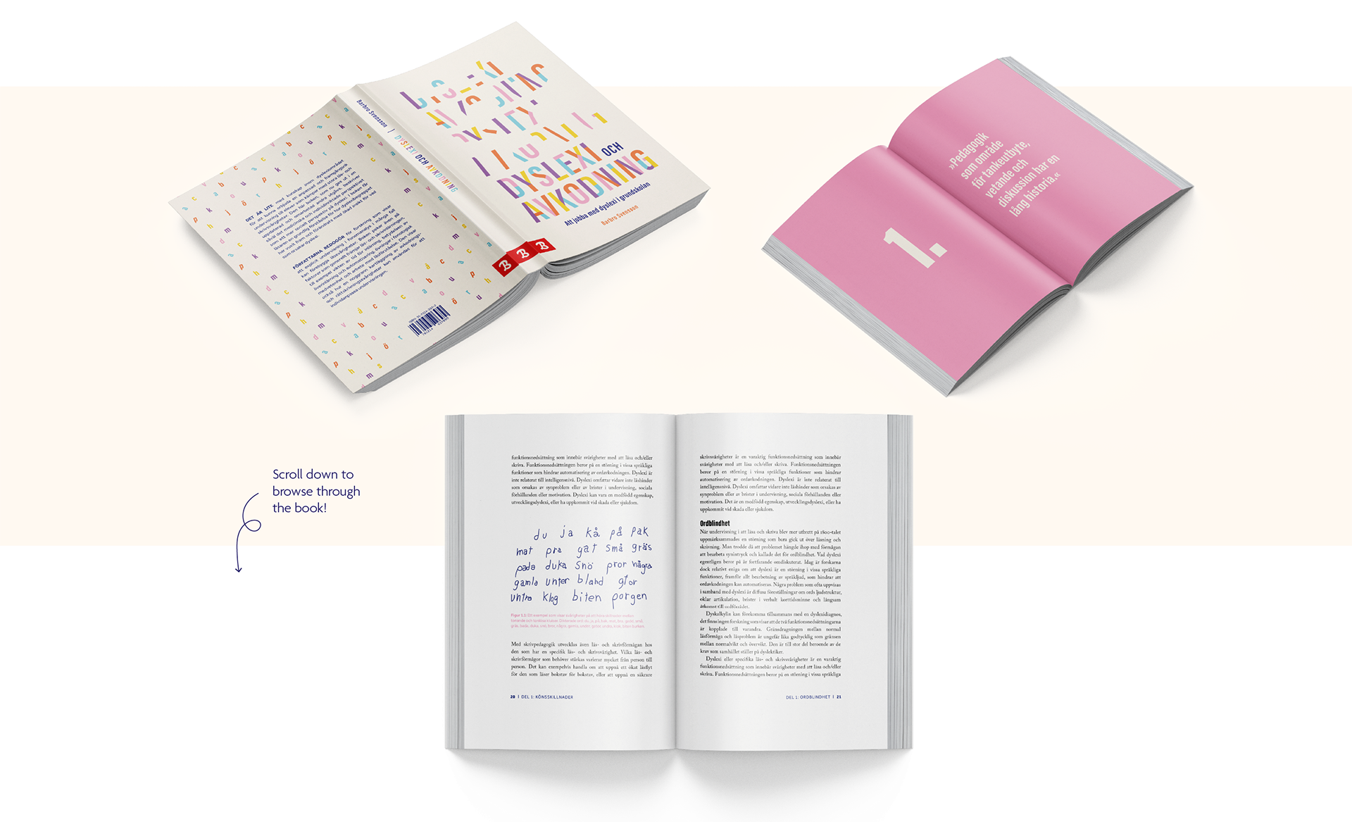
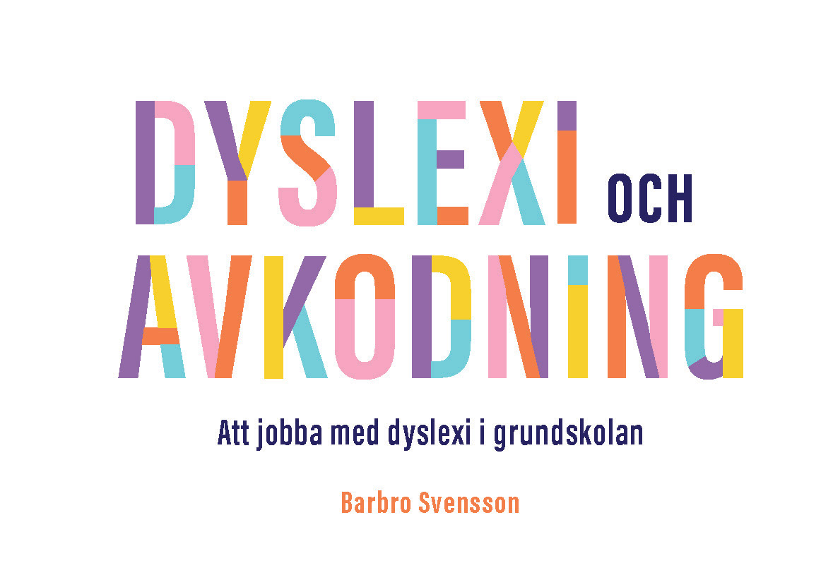
About Dyslexi och Avkodning
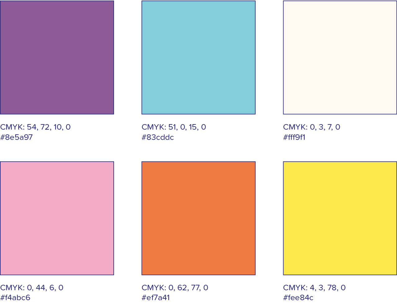
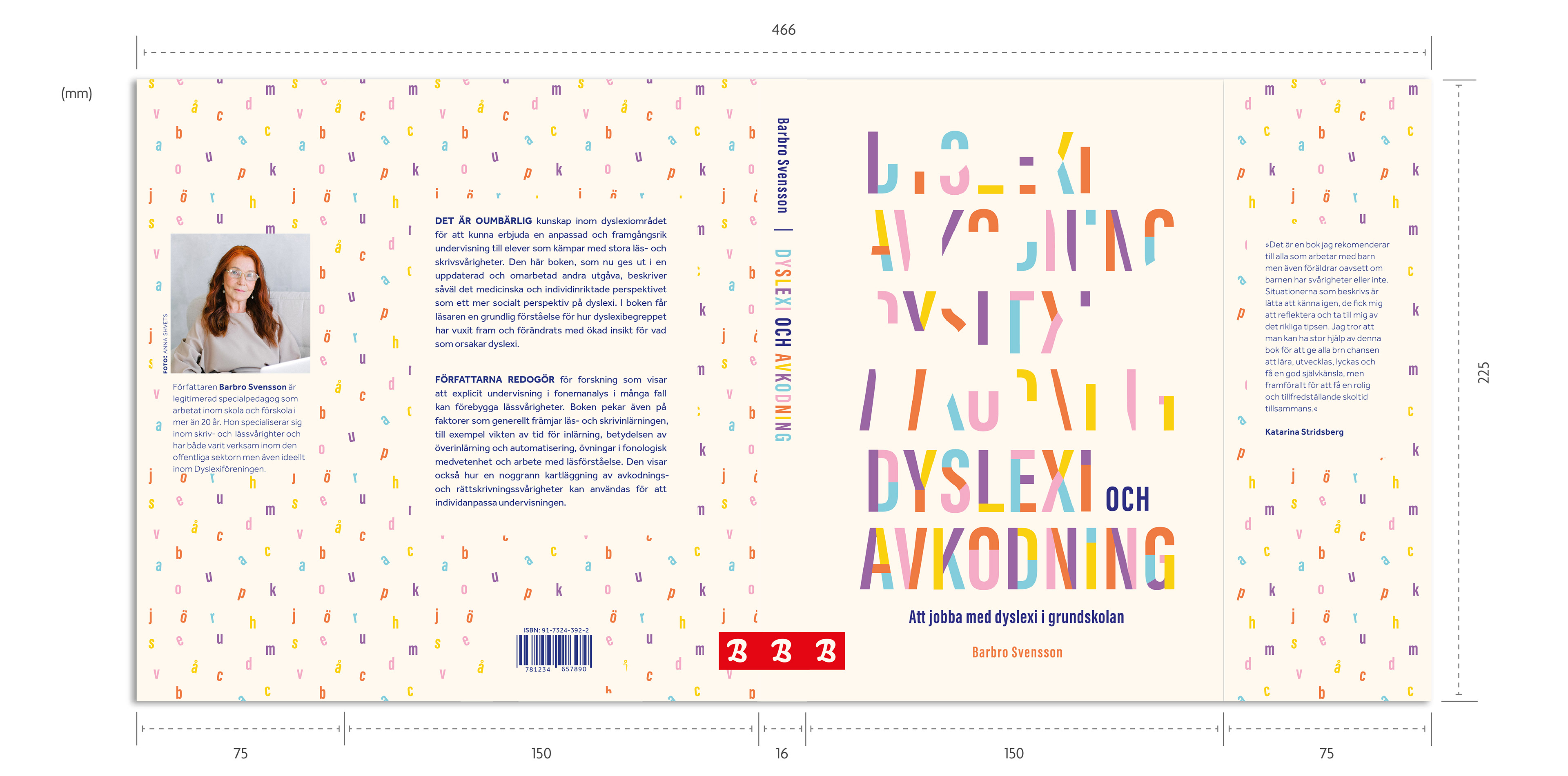
Five happy colors became the palette for this book; pink, orange, yellow, purple and turquoise. These colors are used to divide the chapters in the book and give the books outer edges an interesting visual expression. These colors are set against a white or a light beige to make the colors pop.
The design of the title/logo reflects the subject of the book, how dyslexics, in a way, see letters. Here, the design has taken inspiration from decoding.
The design of the title/logo reflects the subject of the book, how dyslexics, in a way, see letters. Here, the design has taken inspiration from decoding.
Logo
Colors
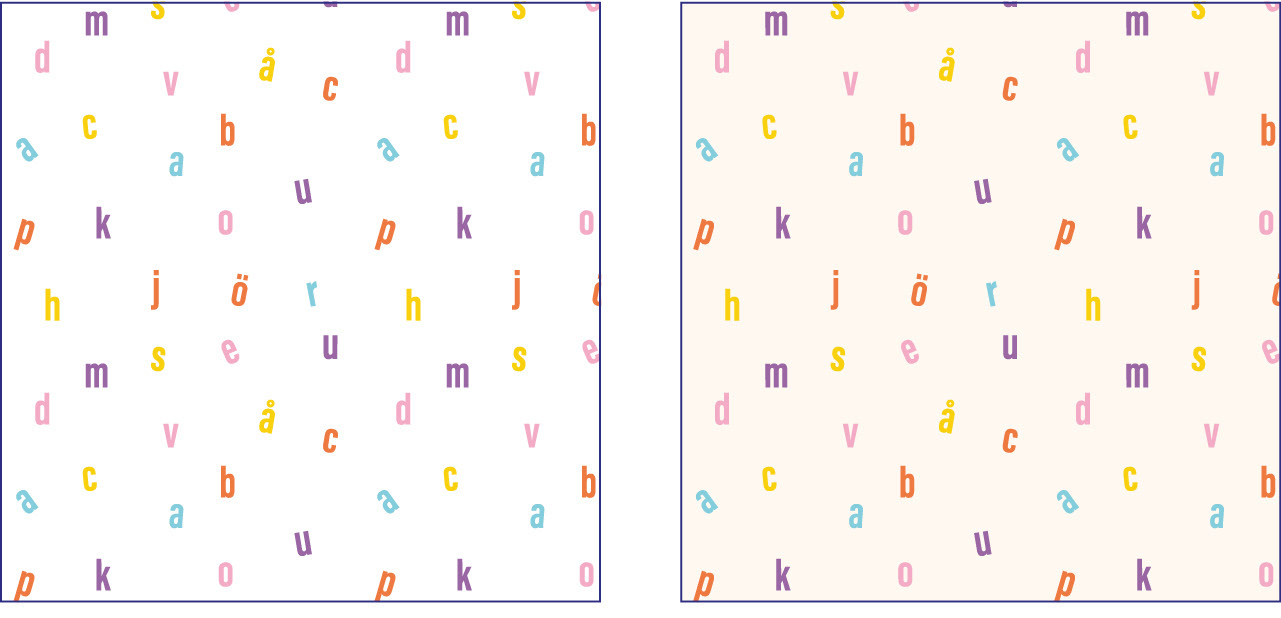
Pattern
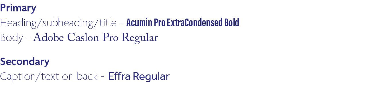
Typography
Soft cover
The grid
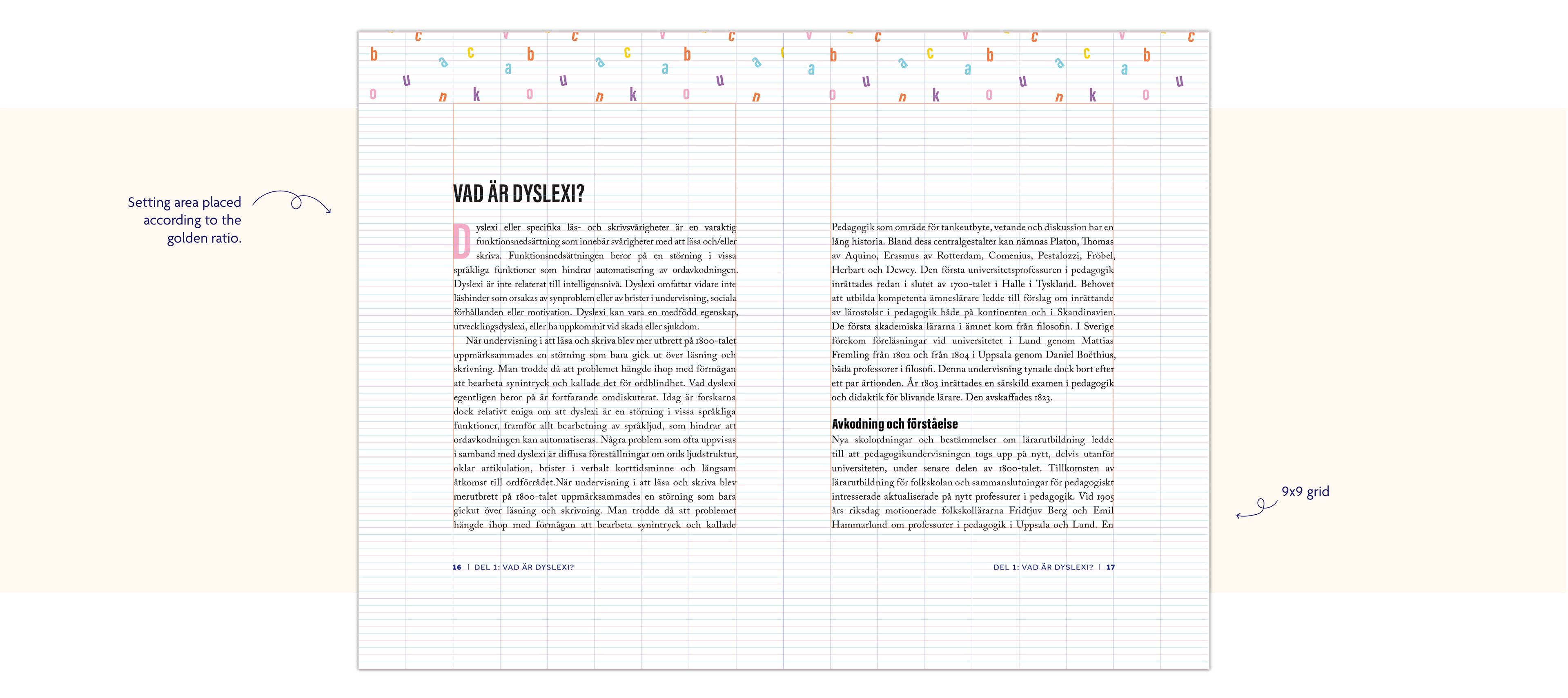
Placeholder text from NE.se