

Rational vs. expressive
.
Project for illustration course
Illustration, poster campaign
2021
Illustration, poster campaign
2021
.
Brief:
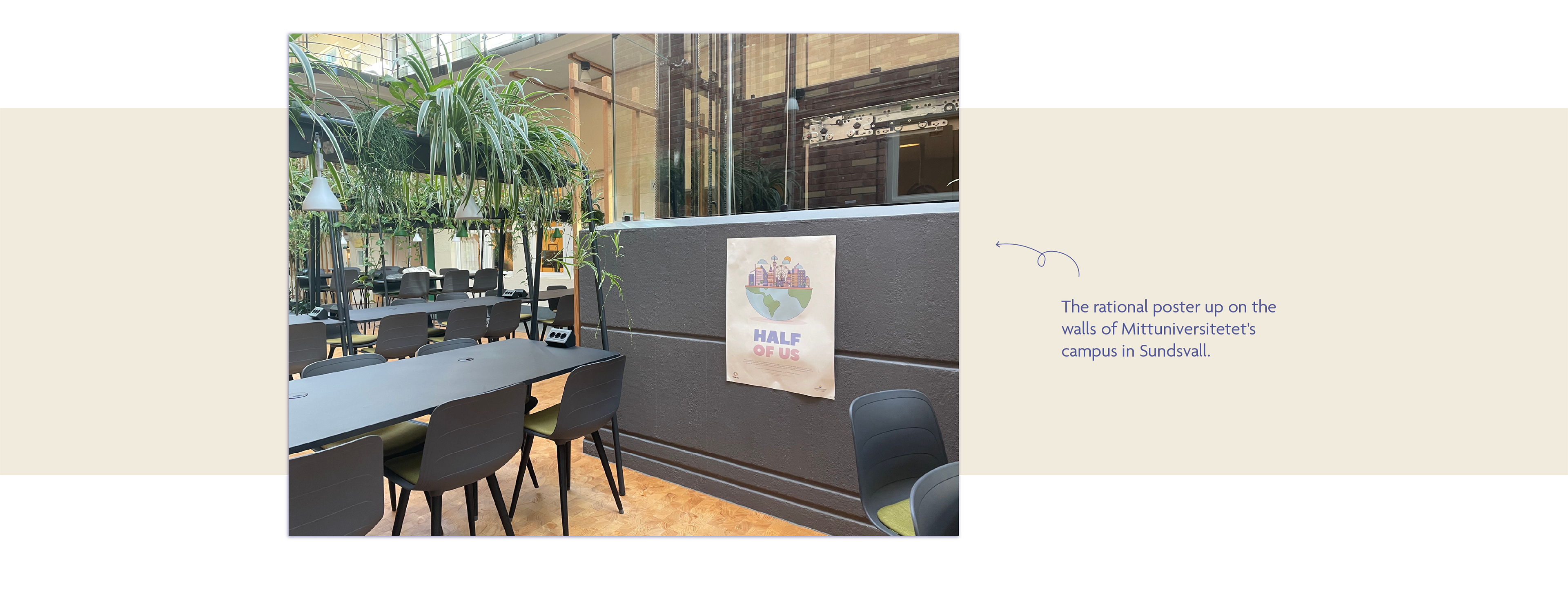
Design two posters to a campaign for one of the UN-goals. In this case for the 11th Goal “Sustainable Cities and Communities”. One poster needs to be expressive and evoke emotions in the viewer. The second poster needs to be rational, to explain the message in a logical way. The dimensions of the posters should be 50x70 cm and will put up at Mittuniversitetet's campus in Sundsvall.
Design two posters to a campaign for one of the UN-goals. In this case for the 11th Goal “Sustainable Cities and Communities”. One poster needs to be expressive and evoke emotions in the viewer. The second poster needs to be rational, to explain the message in a logical way. The dimensions of the posters should be 50x70 cm and will put up at Mittuniversitetet's campus in Sundsvall.
Team:
Lina Svärd
Lina Svärd
Software used:
Adobe Illustrator
Adobe Illustrator
.
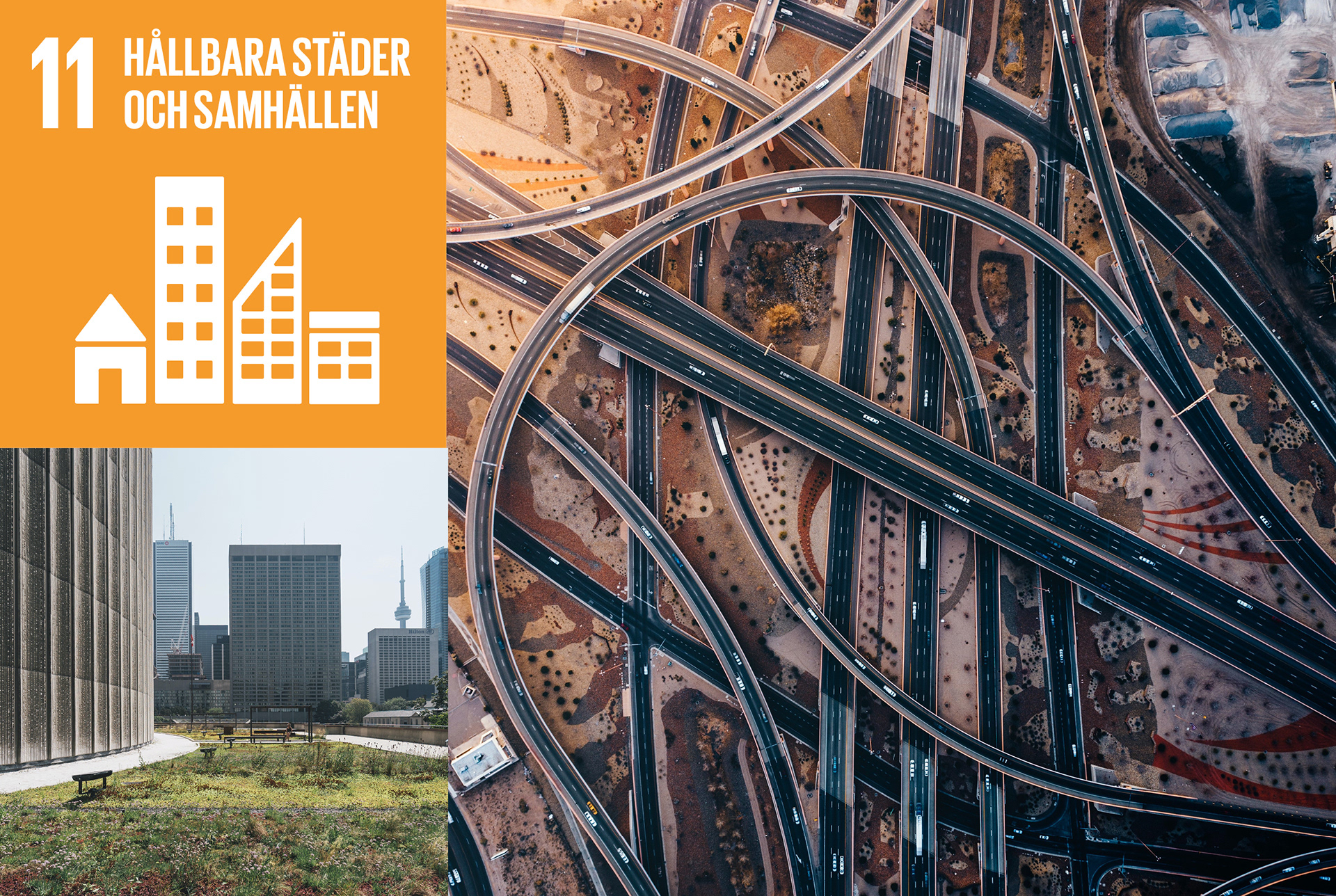
UN-goal 11
Today, more than half of the world's population lives in urban areas is expected to increase to 70 percent by the year 2050. Growing cities could not only provide increased economic growth, but can also contribute to bigger social gaps and put more stress to the climate.
In order to be able to meet these numbers, cities need to set new demands which must be met in an economically, ecologically and socially sustainable way.
Things you can do as an individual is, for example, 1: walk, take the bike or the public transport instead of the car, 2: take care of your public spaces or 3: turn off the lights when you are not using them.
Rationell vs. expressiv
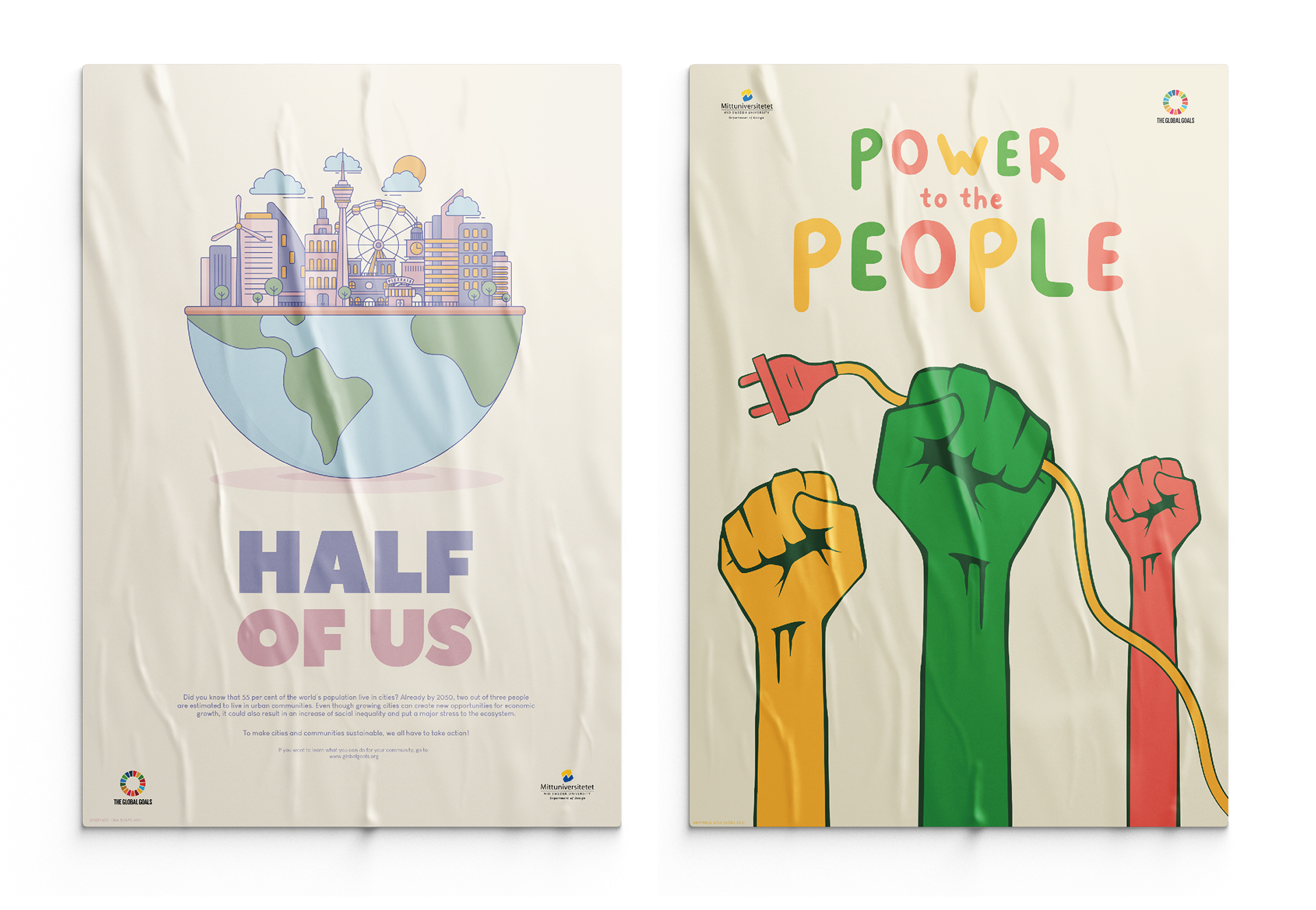
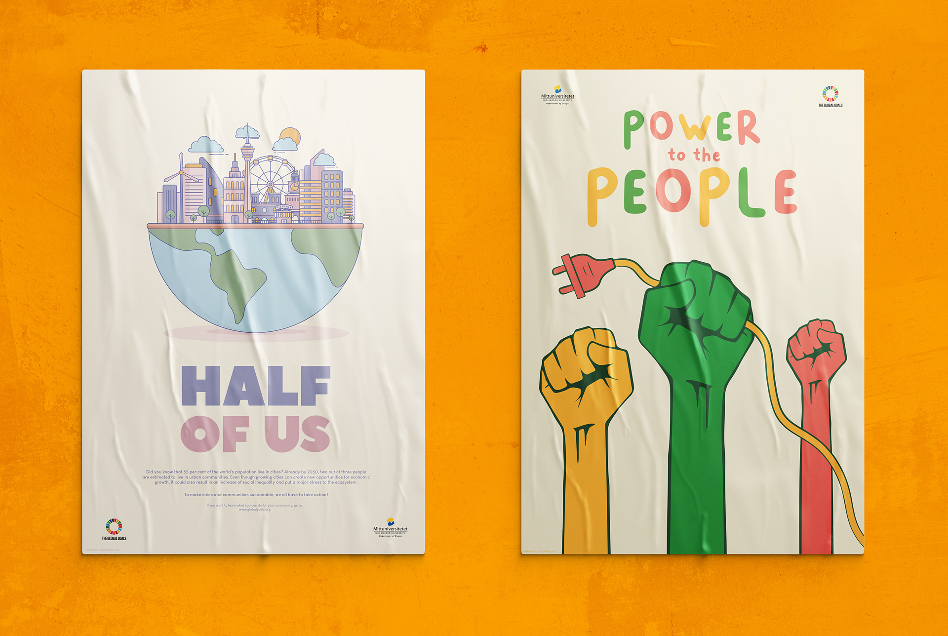
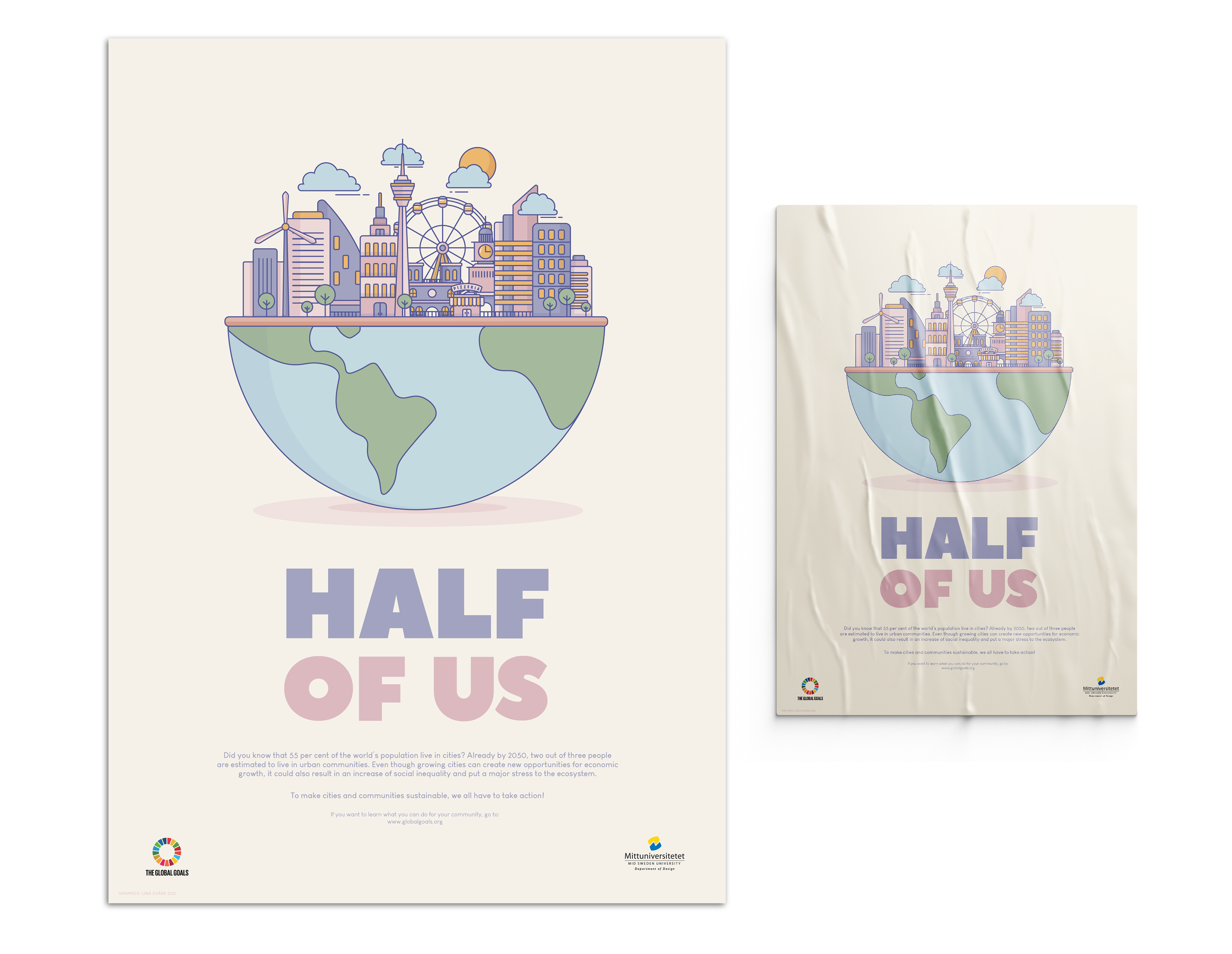
The rational poster depicts a city silhouette set on half a globe to symbolize the inhabitants set in urban environments. The heading "half of us" should reinforce the message as a complement to the illustration. In addition to this, there is a text to explain the message as rationally as possible.
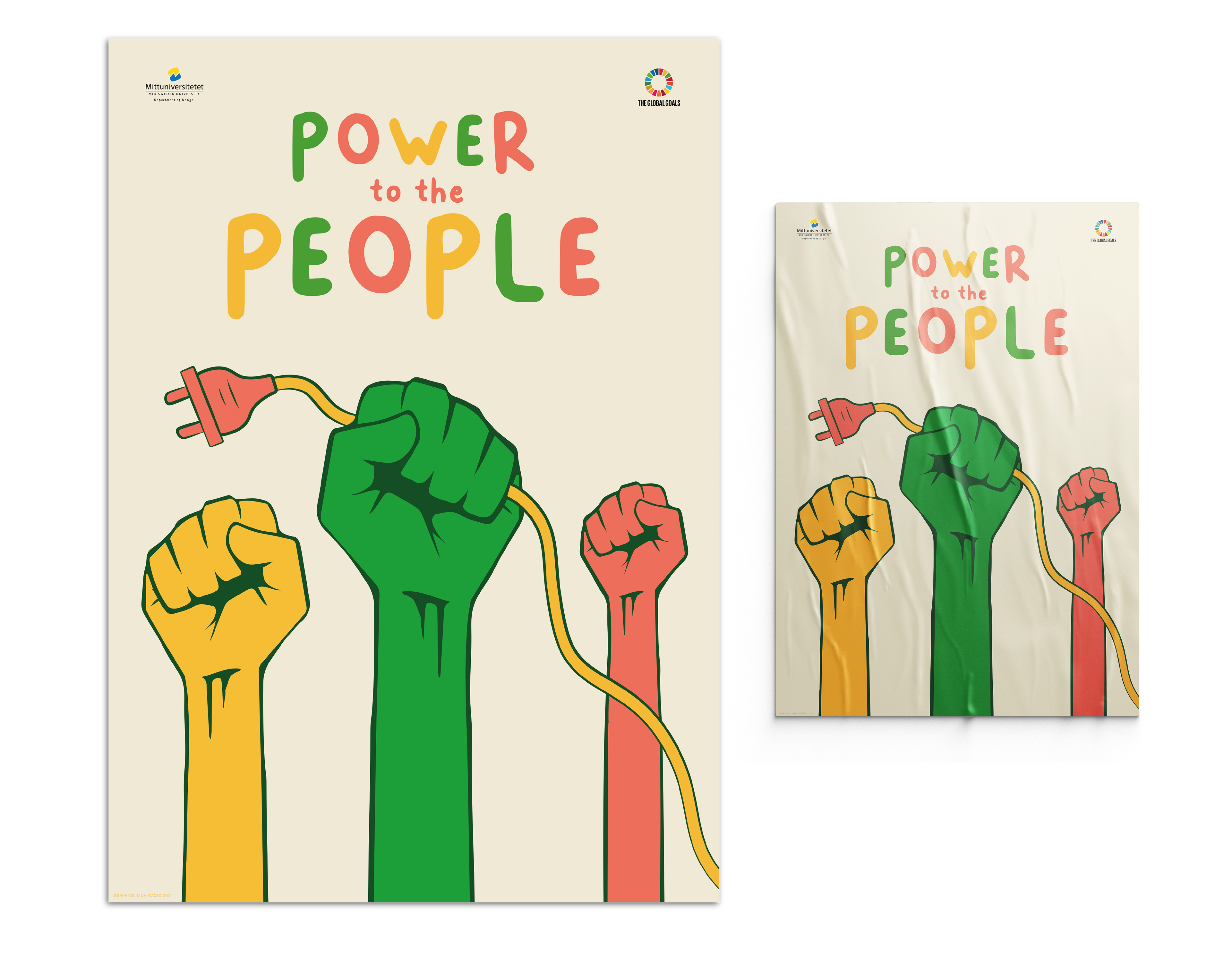
The expressive poster depicts three fists symbolizing power and revolution with one fist holding a plug. With the title "power to the people" the message is to save electricity, it's for all of us after all.
Rational poster
Colors
Typography

Expressive poster
Colors
Typography

Side by side